This is my fourth post on modeling the Coronavirus epidemic. I recommend starting with the first post and reading them in order.
So far, we’ve learned about the SIR model and used available data combined with the model to predict the epidemic. We’re now going to detour into some additional mathematical ideas that will help us get further understanding. At the end of this post, we’ll try to judge how effective the mitigation strategies have been in some countries.
In the second post, we saw that the initial spread of a disease follows a differential equation of the form
\[ \frac{dI}{dt} = \beta I(t). \]
Once you’re comfortable with the idea that \(dI/dt\) just means “the rate of change of \(I\)”, you realize that this is one of the simplest equations imaginable. So it shouldn’t be surprising that this equation comes up a lot in the real world. Its solution is
\[ I(t) = e^{\beta t} I(0). \]
Here \(e\approx 2.72\) is Euler’s number. This equation tells us that the number of infected grows very quickly. In the case of Coronavirus, the number \(I\) can double in about 3 days (you can see more estimates of the doubling time here). We refer to this kind of growth (where a given quantity doubles over a certain time interval) as exponential growth.
Financial advisors love to talk about the power of exponential growth because that’s also how compound interest works. Of course, with most investments it takes a lot more than 3 days to double your money, but the principle is the same. In fact, exponentially growing functions are all around us, and learning how they behave can help you to understand a lot of things.
Let’s look again at our first prediction from the last post:
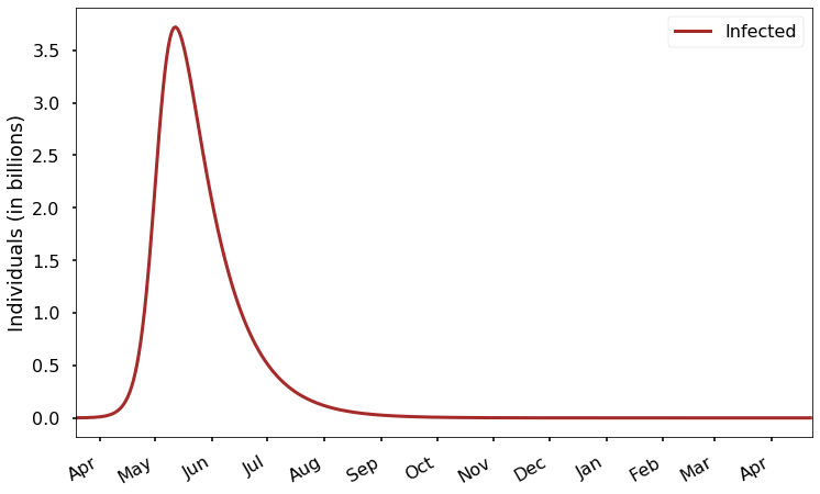
Right now, we are at the very left edge of this plot. How many people are infected at the start of the plot? It looks like zero, but we know there are over 100 thousand current cases. It just looks like zero because the scale here is in billions, and 100 thousand is much too small to see on that scale! This is a common problem with exponentially growing functions. We can try to solve the problem by zooming in on the left end of the graph, showing results for just the next 30 days:
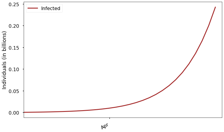
It’s a little better, but even on this scale the current number of infections is too small to be seen. We can try again to fix it by just changing the vertical scale:
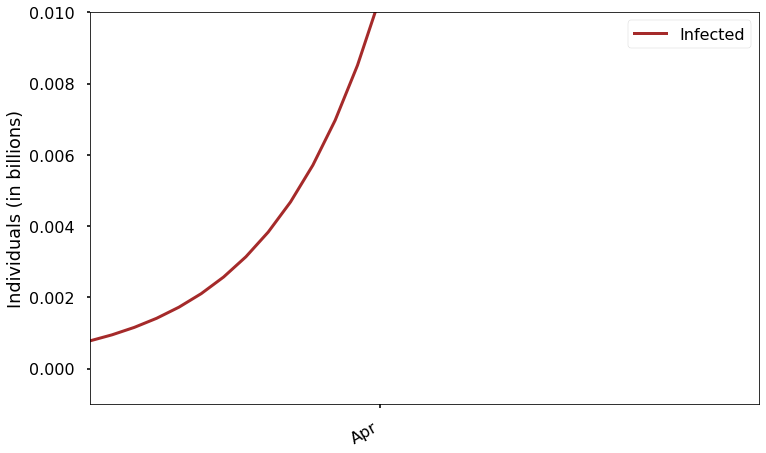
Now we can see that the starting value is not zero, but we can’t see the right part of the graph at all! Let’s find a better solution.
In the plots above, the scale of the \(y\)-axis is linear. That means that equal distances in \(y\) represent equal changes in the value of the function. The problem with using this for an exponentially growing function is that the changes in the function at early times are tiny compared to the later growth.
Instead, we can visualize the growth using a logarithmic scale:
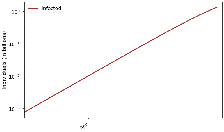
Look carefully at the \(y\) axis here. As you can see, each of the evenly space labels on the axis represents a value 10 times greater than the value below it. In other words, equal distances on this axis represent equal ratios. The great thing about this scaling is that we can easily see how the function varies over the whole graph. It might seem strange that it looks almost like a straight line, but that’s exactly how an exponentially growing function should look on this kind of plot. Remember, equal distances in \(y\) represent equal ratios, and we said that this kind of function doubles over each interval of some fixed size.
With this plot, it’s easy to answer questions like “when do we expect to have more than 1 million cases?” We couldn’t possibly answer that by looking at the previous plots.
We can also see more easily how rapidly the epidemic goes from something small to a true global crisis. At present there are less than a million cases, but before the end of April we would have (without mitigation) over 1 billion. Never in history have that many human beings been ill at the same time with a single disease.
In technical terms, we say this is a semi-log plot, because the \(y\) axis is logarithmic while the \(x\) axis is linear. If both the \(x\) and \(y\) axes were logarithmic, we would call it a log-log plot.
Understanding logarithmic plots is a bit of a superpower, because it allows you to study data by looking at plots like the last one above, which let you simultaneously see the parts where the function is small and big.
Here’s a semilog plot of our basic model for the epidemic over the next year:
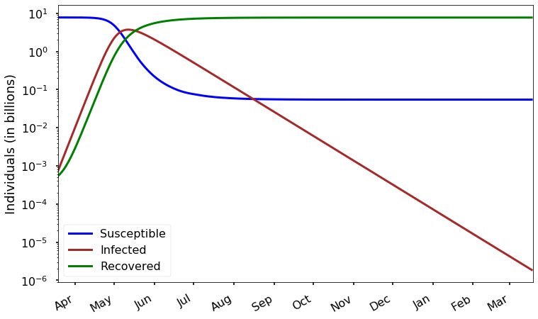
Remember, this is exactly the same data that’s in the first plot near the top of this post. We’re just looking at it in a different way. But with this new plot we can much more easily see how many susceptibles remain at the end of a year: about a tenth of a billion, or 100 million.
We can also see that there are still about 1000 infected people in this model at the end of a year. Notice that after the infection peaks, it declines in a way that also looks like a straight (downward-trending) line on this plot; that means that the decrease is also exponential. In other words, after we pass the peak of infection, the number of infected individuals will consistently reduce by a factor of two over a certain time interval. Looking back at the model, we see that the rate of decrease is determined by \(\gamma\). In the late stages of the epidemic, because the fraction of susceptible people is small, we have approximately:
\[ \frac{dI}{dt} = -\gamma I(t) \]
whose solution is
\[ I(t+\tau) = e^{-\gamma \tau} I(t), \]
which, for our estimate \(\gamma \approx 0.05\), implies that the number of infections is reduced by half about every 14 days.
Armed with our new superpower, let’s look at our data from specific countries with this logarithmic scaling. We’ll start again with Italy.
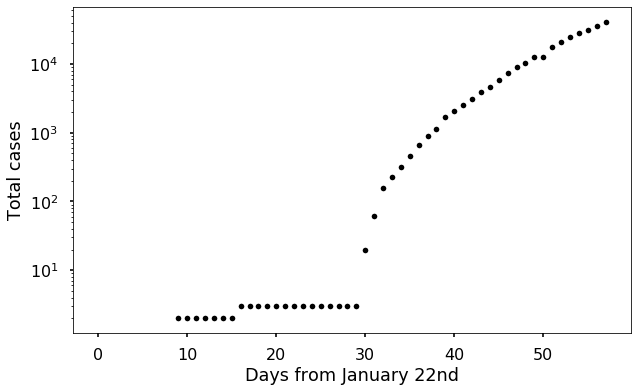
Several things become clearer with this scaling. Notice that the plot is not a straight line, but we can make good guesses as to why. Before day 30 (February 21st), there were only one or two known cases, and after day 30 there was a very abrupt increase. It seems likely that the virus was spreading before day 30 and the new cases were only detected later. This matches with statements from experts in Italy.
Recall our full model equation for \(I(t)\):
\[ \frac{dI}{dt} = (\beta \frac{S}{N}-\gamma) I \\ \]
Since only a tiny fraction of the whole Italian population is infected, we have \(S/N\approx 1\), so the slope of our exponential growth line on a semilog plot should be \(\beta-\gamma \approx 0.2\). Let’s see how a line with that slope matches the data:
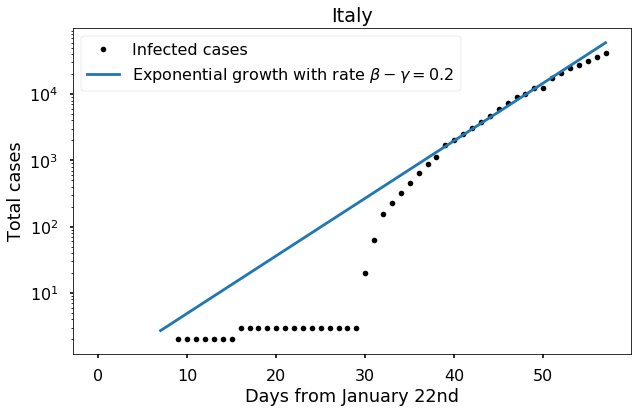
Note that we are doing essentially the same thing that we did when trying to determine \(\beta\) in the second post of this series; but now we are looking at the results on a log scale to reveal more detail.
It seems plausible (not utterly convincing) that the virus has been spreading at this expected rate in Italy for about 50 days now. However, notice that in the last week the slope seems to have decreased. Since Italy is now making great efforts to detect all new cases, it seems most likely that this is the result of mitigation. It’s probably too soon to try to assess the effectiveness of that mitigation, but let’s make an attempt anyway:
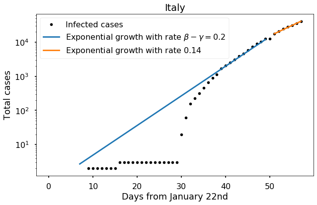
We see that the slope over the last several days is about 0.14, corresponding to a mitigation factor \(q \approx 0.7\) in the model I introduced in the last post.
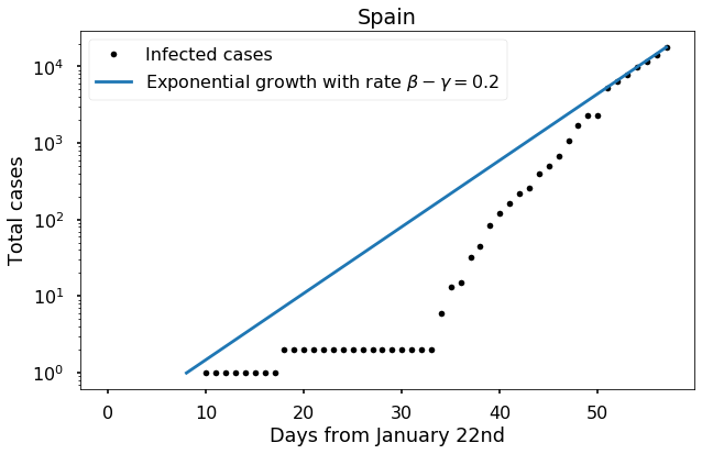
For Spain, we see a similar pattern, but no sign of any impact from mitigation yet.
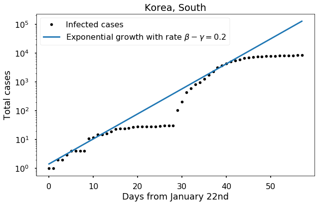
For South Korea, up to about day 40 we see the same pattern (with again a similar plateau in late February followed by a rapid rise when testing increased). But afterward we see completely different behavior, as the curve flattens. Given that South Korea has perhaps the most agressive testing strategy in the world, it seems unlikely that this can be attributed to new infections going undetected. Instead, the evidence suggests that mitigation strategies have been very successful. We can measure this success by looking at how much the slope of the curve has changed:
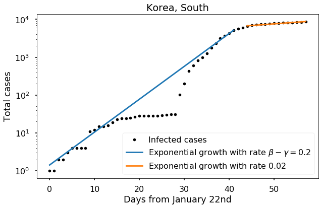
An approximate fit to the data from recent days suggests that the growth rate has been cut to approximately \(0.02\); this would correspond to a value of \(q\) (from my previous post) of about 1/4, meaning each infected person on average transmits the disease to only 1/4 as many people as they naturally would. But again it is probably too early to estimate this number with confidence.
In the next post in the series, you can experiment with the model yourself.